The way I letter has gone through several variations. For the first three pages I stuck speech balloons onto the original artwork, but then I started adding the balloons and type digitally in Photoshop. With publication through Egmont, the process has changed again with the lettering being set in Adobe InDesign. You can read a blog entry about the relettering process I went through here.
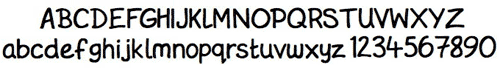
When book publication became imminent, I at last decided to create my own hand-lettering font. It's all very well using another style (I had bought a nice little font called WhizBang for the lettering previously) but in order to make The Rainbow Orchid completely my own work, I wanted the lettering to be my own as well. So I purchased TypeTool from FontLab, and got to work creating GarenHand.
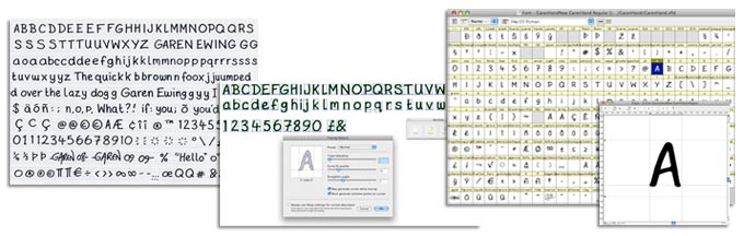
The first stage in this process was to write out two or three sheets of samples of my own hand lettering. These were scanned into the computer at high resolution and, after I'd chosen the best examples of each letter, brought into ScanFont which separated the letters and turned them from bitmaps into vector shapes. These vectors were then imported into TypeTool where they were edited and the kerning and metrics set before being exported as a TrueType font.
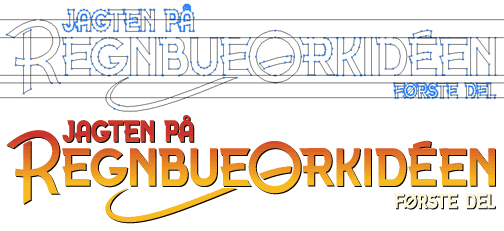
Another aspect of lettering was the design of the Rainbow Orchid title. For this I'd originally used a 1920s-looking font, but again, when I knew a book was to be published, I wanted my own identity so redesigned the title graphic and also created another font from it, called 'Rainbow Orchid'. I redesigned the title for most of the foreign editions as well - here you can see the Danish version.
The lettering is pretty much the final step in the creative process of putting together a page of The Rainbow Orchid. In truth, this look at the process has made it seem a little more organised than it is in reality - not everything is always done in the right order, and not always in the same way. But that's pretty much it!