


For colouring, the bitmap artwork is converted to RGB* mode (rather than CMYK**, to keep the file size down while working) and the black line is isolated and copied onto its own layer and locked. The layer underneath is where the colours are laid.
* RGB: red-green-blue, an additive colour space for on-screen output; ** CMYK: cyan-magenta-yellow-key, a subtractive colour space for print
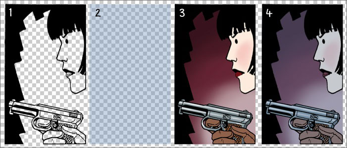
- the black line (clean bitmap, no anti-alias), which sits on top
- a 35% blue tint as this scene takes place in a darkened warehouse - this can also be used for night scenes
- the colour layer - the artwork is coloured mainly using the pencil, brush, paint bucket and selection tools
- the end result with all layers combined
I keep my colours mostly flat and simple for the clean graphic look I like for the strip. This includes using a fairly subdued colour palette that was initially based on a Dulux 'Heritage' colour chart (but has since expanded beyond that as I got a feel for the colours). As well as preventing me from straying into too many bright and gaudy colours, it lends to the 'historical' atmosphere that works for the story and also keeps the colour range 'in gamut' when converted to CMYK for print. I also avoid using computer effects and the gradient tool (I do use gradients sparingly, but they are all 'hand made' with the brush tool).

Once the page has been coloured, the artwork is copied onto a master page template ready for lettering, the next step in the process...