

This blog began in 1997 as a single news page called Nucelus. In 2005, during a long wait to move into a new house, I decided to learn some php and MySQL and write my own blogging system, which became inkyBlog and which now powers this, my own Webbledegook blog.
Thank you to my brother, Murray Ewing, for help with some of the more challenging aspects!

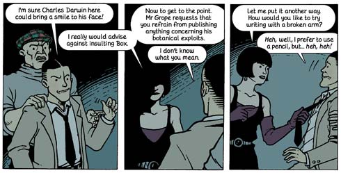
This is entirely my own decision/fault. I do all my own lettering, but Egmont re-set the lettering in-house, and while I want it to remain just as I set it originally (or as close as possible), the question of foreign language editions has come up. After seeing the first set of proofs, I decided my original balloons were a little too tight, so have spent the last few days re-adjusting everything. I truly hope this is the last time I make myself do this - part one has a long history of re-lettering and balloon adjustment, and it can send you just a little bit crazy, nudging balloons a couple of pixels to the left, shifting lettering a few pixels up, then down...
For the first three pages I used a method I'd devised when doing my comic strip adaptation of The Tempest, namely making up the lettering and speech balloons in QuarkXpress (I'm now an InDesign user), printing them, cutting them out, pasting them on to the original artwork, and using Tippex to draw the balloon tails on. And yes, I think I did indeed use ComicSans for this... it wasn't such a big crime in 1997.
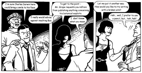
By the time Orchid started appearing in BAM! I was adding all 'speech furniture' exclusively on the computer, and when I put out the first black and white collection in late 2003 I re-set the first three pages too. You can see here some slight adjustments to the look of the characters as they had grown into themselves a lot more since these early pages were first drawn. By now I'd changed my font to WhizBang after it being recommended by 2000AD artist P. J. Holden.
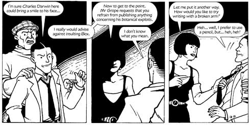
Not wanting to reprint part one, but wanting to make my story available to new readers, I soon started putting Orchid on the web, which allowed me to put the strip into colour at last. In print the lettering had been done at 6pt, so as well as colouring it I enlarged the font to 6.5pt, and adjusted the balloons accordingly.
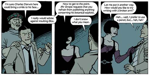
When the Forum Ligne Claire translated the text into French, I re-did all the balloons too, so everything fitted just right.
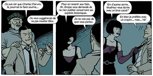
With publication by Egmont looming, I realised a long-held desire to create my own hand lettering font, which of course meant I had to re-set all the text once more. I also increased the font size to 7.5pt to make it as comfortable as possible.
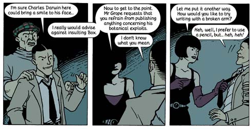
Upon seeing the first set of proofs I still felt the lettering was a bit too snug, and wanted a bit more space for the lettering to breathe. Also, it might mean less work if foreign language editions come into play (though some panels would probably still require adjustment). So I've set upon the latest programme of text and balloon adjustment. You know, if a job's worth doing, it's worth doing properly!